Picturing high-dimensional data

Data science tools help us to see more clearly the dimensions of a vast array of fields, from unemployment figures, university rankings, power supplies in urban settings and manufacturing output, to name but a few, according to Professor Joe Qin Sizhao, Dean and Chair Professor of the School of Data Science at City University of Hong Kong (CityU).
Professor Qin was speaking at the latest instalment of the President’s Lecture Series: Excellence in Academia.
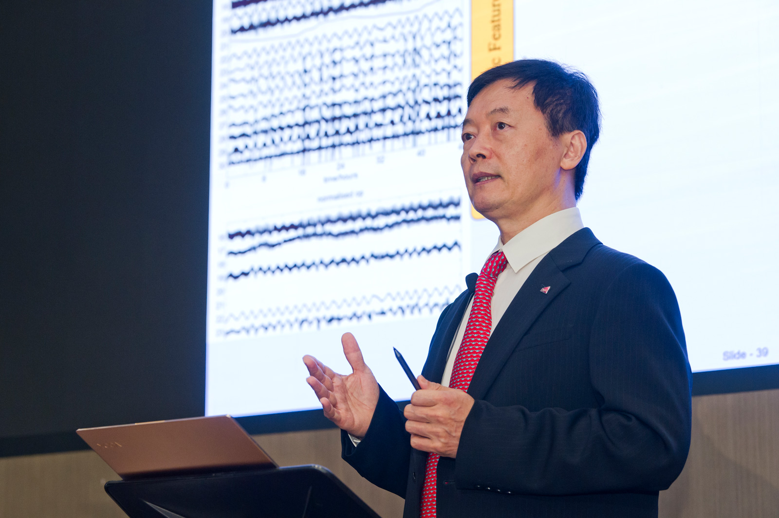
“Data analytics bring intelligence and knowledge for predicting and inferring causality,” said Professor Qin, who is also the Director of the Hong Kong Institute for Data Science. “You start with a problem and then you collect the data and look for dynamic features.”
The speaker said he chose this topic “Picturing high-dimensional data” for his talk, which was delivered both online and with a limited audience on campus, because the visualisation aspect of data science possesses extensive applications in a world packed with data.
There are estimated to be around 200 trillion tweets a year, over 52 million pages on Wikipedia, and 79 million academic papers on the Clarivate’s Web of Science, he said. Without visualisation tools, a firm concept of how large these data sets really are is almost unthinkable.
To illustrate this point, Professor Qin played a video that revealed how new ideas cluster, germinate and evolve at certain points in history. The video presented the extent of the academic research on which a seminal paper, in this case Crick and Watson’s on the double helix published in the 1950s, depended; as well as the breadth of later research that has drawn on the initial Crick and Watson breakthrough publication.
In addition, Professor Qin explained how data science tools can reveal the “dark side” of data, i.e. areas of uncertainty in, for example, the development of new technologies, and that they are not only for highlighting the positive “white side” of algorithm-generated data.
Professor Qin concluded that visualisation tools are essential for areas as diverse as business analytics, financial technology, e-commerce, social media analysis, health informatics, engineering systems, and smart city technology. With the exponential growth of big data and the data sciences, the need for such visualisation tools can only grow stronger.